
A Renewed Direction for the
Wounded Warrior Project
Client:
Wounded Warrior Project
New Website Design
2017 - 2018
Contribution:
Marketing Strategy
User Experience Design
User Interface Design
Cross-Team Collaboration
Presentation & Communication
THE CHALLENGE
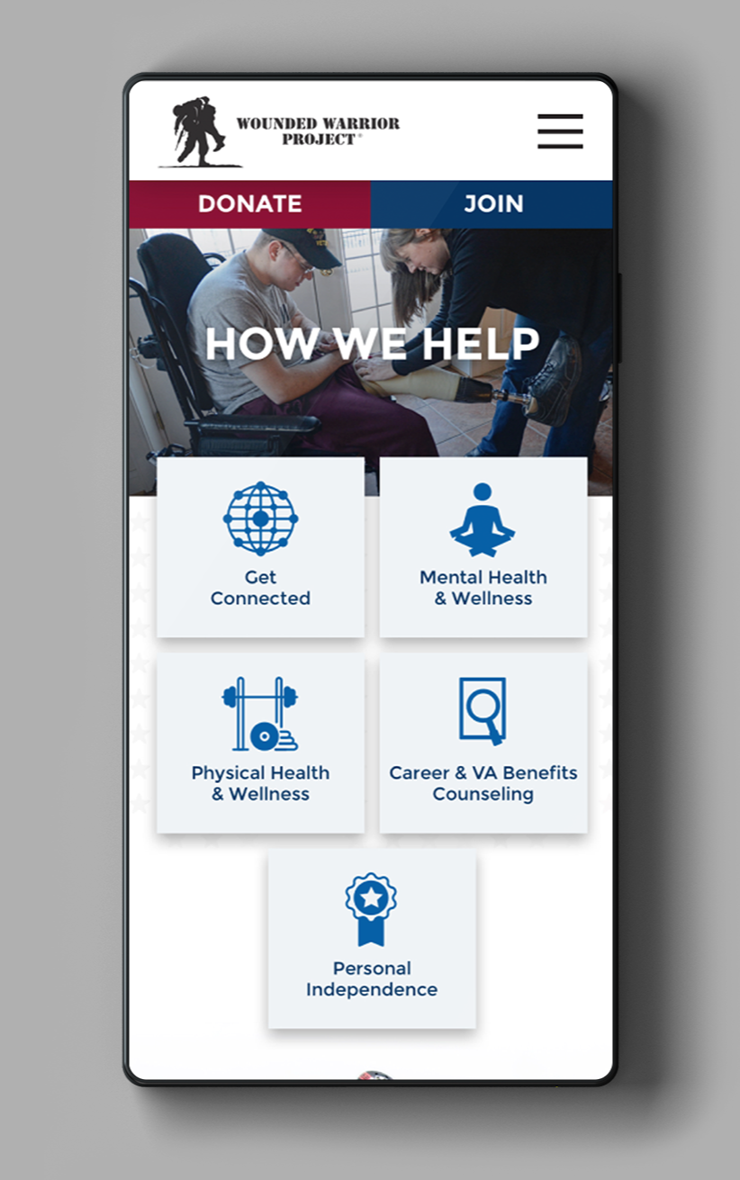
Create a refreshed web presence that will prioritize the needs of the Warriors and their families. Also, to build a cohesive narrative around how the Wounded Warrior Project has and currently is helping our veterans. The logic being that if the organization puts the Warriors first, then donations and recruiting more volunteers will naturally follow.
Collaborative challenges: Our team was brought in to completely overhaul the user experience and user interface. We would be working in conjunction with not only their internal marketing and development team, but six additional departments that would have input for the new website.


THE FUNDAMENTALS
- Emphasize the core mission of the Wound Warrior's Project.
- Speak directly to the Warriors as a source of help and guidance.
- Offer a direct path for individuals and organizations to help through donation & service.
- Reinforce the credibility of the Wound Warrior's Project using facts and statics to illustrate its impact.

THE DESIGN
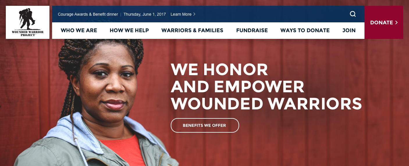
For the homepage's UI, we established a style that was in line with our “Northstar” adjectives - optimism, lightness and intuitiveness. White and light grey colors were used in conjunction with watermarked images to form the background. For the foreground, I utilized full-colored elements that would overlap the background. This gave the interactive components the appearance that they were floating from the background when the user interacted with them helping to help emphasize the “lightness” theme. All the photographs that were used portrayed individuals in a positive and proud way in keeping with the optimism that we want to portray on the new website. The "Call-to-Actions" elements are concise and easy to understand at glance helping to make the user interface more intuitive.
For the homepage's UI, we established a style that was in line with our “Northstar” adjectives - optimism, lightness and intuitiveness. White and light grey colors were used in conjunction with watermarked images to form the background. For the foreground, I utilized full-colored elements that would overlap the background. This gave the interactive components the appearance that they were floating from the background when the user interacted with them helping to help emphasize the “lightness” theme. All the photographs that were used portrayed individuals in a positive and proud way in keeping with the optimism that we want to portray on the new website. The "Call-to-Actions" elements are concise and easy to understand at glance helping to make the user interface more intuitive.
For the homepage's UI, we established a style that was in line with our “Northstar” adjectives - optimism, lightness and intuitiveness. White and light grey colors were used in conjunction with watermarked images to form the background. For the foreground, I utilized full-colored elements that would overlap the background. This gave the interactive components the appearance that they were floating from the background when the user interacted with them helping to help emphasize the “lightness” theme. All the photographs that were used portrayed individuals in a positive and proud way in keeping with the optimism that we want to portray on the new website. The "Call-to-Actions" elements are concise and easy to understand at glance helping to make the user interface more intuitive.
For the homepage's UI, we established a style that was in line with our “Northstar” adjectives - optimism, lightness and intuitiveness. White and light grey colors were used in conjunction with watermarked images to form the background. For the foreground, I utilized full-colored elements that would overlap the background. This gave the interactive components the appearance that they were floating from the background when the user interacted with them helping to help emphasize the “lightness” theme. All the photographs that were used portrayed individuals in a positive and proud way in keeping with the optimism that we want to portray on the new website. The "Call-to-Actions" elements are concise and easy to understand at glance helping to make the user interface more intuitive.
For the homepage's UI, we established a style that was in line with our “Northstar” adjectives - optimism, lightness and intuitiveness. White and light grey colors were used in conjunction with watermarked images to form the background. For the foreground, I utilized full-colored elements that would overlap the background. This gave the interactive components the appearance that they were floating from the background when the user interacted with them helping to help emphasize the “lightness” theme. All the photographs that were used portrayed individuals in a positive and proud way in keeping with the optimism that we want to portray on the new website. The "Call-to-Actions" elements are concise and easy to understand at glance helping to make the user interface more intuitive.


THE IMPACT
In the four years since the redesign of the website, donations have increased almost 28%. Users are more engaged with the organization online with 92% saying that the virtual events and programs have helped relieve stress brought on by the pandemic. Overall user engagement with the website has risen 24% since the launch of the new design. A new design system was created that is still being followed almost 4 years later. We helped the Wounded Warrior Project's web team streamline their internal design and development processes by teaching them how to use the Sketch and Zeplin.
In the four years since the redesign of the website, donations have increased almost 28%. Users are more engaged with the organization online with 92% saying that the virtual events and programs have helped relieve stress brought on by the pandemic. Overall user engagement with the website has risen 24% since the launch of the new design. A new design system was created that is still being followed almost 4 years later. We helped the Wounded Warrior Project's web team streamline their internal design and development processes by teaching them how to use the Sketch and Zeplin.
In the four years since the redesign of the website, donations have increased almost 28%. Users are more engaged with the organization online with 92% saying that the virtual events and programs have helped relieve stress brought on by the pandemic. Overall user engagement with the website has risen 24% since the launch of the new design. A new design system was created that is still being followed almost 4 years later. We helped the Wounded Warrior Project's web team streamline their internal design and development processes by teaching them how to use the Sketch and Zeplin.
In the four years since the redesign of the website, donations have increased almost 28%. Users are more engaged with the organization online with 92% saying that the virtual events and programs have helped relieve stress brought on by the pandemic. Overall user engagement with the website has risen 24% since the launch of the new design. A new design system was created that is still being followed almost 4 years later. We helped the Wounded Warrior Project's web team streamline their internal design and development processes by teaching them how to use the Sketch and Zeplin.
In the four years since the redesign of the website, donations have increased almost 28%. Users are more engaged with the organization online with 92% saying that the virtual events and programs have helped relieve stress brought on by the pandemic. Overall user engagement with the website has risen 24% since the launch of the new design. A new design system was created that is still being followed almost 4 years later. We helped the Wounded Warrior Project's web team streamline their internal design and development processes by teaching them how to use the Sketch and Zeplin.
Credits:
Agency: Levatas
Director of Design: Andrew Pignato
Director of UX: Brittany Albuquerque